
The Client
AMP is a leading wealth management company with more than 3.4 million customers and 3,900
employees in Australia and New Zealand. AMP is also Australia's largest retail and corporate
superannuation provider with more than $AU129 billion in assets under management.

Revolution of some of the print based collateral.
The Challenge
In 2000, AMP had decided that the time was right to commence the evolution of the company's
brand identity. Firstly however, AMP felt it was necessary to unify the visual messaging strategy
across all five sectors of the business, sectors that had up to that point operated almost
autonomously.

Research showed that while AMP was still highly regarded in rural Australia (very much the birth
place of the company in 1849), the rest of Australia saw AMP as a faceless insurance institution
instead of the modern financial services company it had become.
In essence, the company lacked a cohesive branding strategy that would bring together the separate
business divisions to speak visually with one voice; and to a much wider audience.

AMP Financial Services print collateral
The Solution
A completely new AMP visual language was firstly applied to marketing communication within parts
of the Australian 'Financial Services' division; this being the largest promotional touchpoint with AMP
customers. With this successful first phase, the model was implemented into all other retail divisions
and finessed to accommodate points of difference.


Design of the AMP road-show trailer, promoting the AMP brand around Australia
The Brand Evolution
Through a thorough understanding of the company, its culture, its future vision and, importantly, an
in-depth knowledge of the essential requirements of any brand evolution, everything pointed to the
new identity having to reflect a modern progressive company without losing any of the heritage
contained in the old identity.
Once achieved, the new identity was placed throughout all previously designed corporate
communication as well as environments and signage.
The logistics of going about the brand evolution in what was essentially the reverse order to that of
a traditional re-branding exercise (i.e., visual language first, brand mark second) was considered a
great achievement by the heads of AMP... however, a brand mark designed correctly and strategically
should harmonize with any well-designed visual communication.

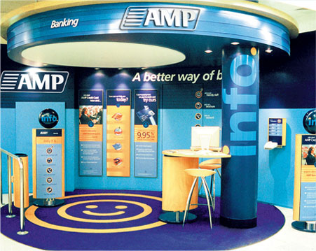
New brand mark implemented into retail enviroments and signnage.
The Outcome
Almost 10 years on, the AMP visual language has had two make-overs; but the AMP brand mark today
is as fresh, adaptable and relevant as on the day it was unveiled. As should be the aim on all brand
evolutions, the brand mark has been able to grow with the company over this period and through
multiple identity reviews.

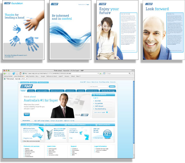
Examples of how the redesigned AMP brand mark has been applied to evolved marketing
and communications collateral since 2000. New collateral and Website not designed
by SpiroDavis
Download case study pdf
© 2010
