
The Sydney Olympics Bid
It is very rare bringing a brand to life and forging a campaign from absolutely nothing more than a
brand mark no one knows; and rarer still to be doing it for a project on the scale of an Olympic bid.
The Clients
Sydney Olympics 2000 Bid Limited (SOBL); The International Olympics Committee (IOC);
State Government of NSW; The Federal Government; and 26 sporting bodies.

Street banners and posters which adorned Sydney from pillar to post.
The Challenge
The deadline appeared unachievable. A brand experience had to be created and the bid books
produced... books which encapsulated everything about how Sydney was going to be able to handle
an event of such magnitude; 750 pages of profusely illustrated text... and delivered to the IOC in
Lausanne in just the first three months of what was a total nine-month schedule. Just to make it
a little more fun, Christmas was in the middle of the bid-book deadline.
Keith Davis hand picked a team of designers... a team brought together for its individual skills...
a team required to achieve what, on paper, seemed an impossible task. Yet another example of how
experience counts when the stakes are high.

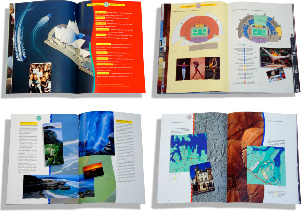
The Bid Books: 750+ pages presented to the IOC in Lausanne, Switzerland
The Bid Books
There were over two hundred contributors, writers, editors, photographers, illustrators, architects,
urban and landscape planners, researchers, translators... and on it went. Legal issues and signoffs
were never ending and all material and copy were not sequential. We worked on a random base
most of the time not knowing what would be on the next or previous pages; and, to add a bit of
spice, the books were bilingual (French and English). The collation of the material was hard to
imagine but we got it right; 750 pages spread over three books and only one blank page where
something was pulled at the very last moment.

Bid Book example spread designs
Visual Strategy
From the outset, it was decided the visual strategy required a power-blocking exercise, using the
brand mark and Olympic colours to ram home the message; and flooding as much visual information
into the market place as the extremely tight budget and time-frame would allow. Brochures,
newsletters, programs, flyers, CDs, print ads, TV ads, posters, banners... the list of collateral was
endless; and whatever was produced had to maintain the integrity of the Olympic institution and its
Brand at all times. All-in-all, there was a nine-month window to get the public, government and
business to support the bid.

Various marketing communication collateral

Top - The A3 Summary Brochure - delivered to all IOC delegates 48 hours prior to final voting
Below - The Cultural Brochure - outlining events and entertainment during either side of the games

The Outcome
The outcome, as we now know, is history. Interestingly however, Juan Antonio Samaranch (President
of the Olympic Committee at the time) made a point of saying that he "always knew when something
from Sydney was on his desk... just by its visual presentation, it always made (him) want to see
and read what had arrived".
That simple statement says a great deal about the power of great design.
Download case study pdf
© 2010
